arrow_circle_left
Back
UX | UI
8 min read

Paymi Rewards Redesign — Increasing Card Connections by 15% through Simplified Flows and Modernized UI.

In this project, I worked to redesign Paymi’s web app to make earning and redeeming cashback more intuitive. This process streamlined navigation, modernized the UI, and clarified key account info to improve trust and usability among skeptical users.
Please note that this case study is not optimized for mobile devices, and I recommend viewing this work, and it's images on a desktop (or laptop!) device for the best experience :)

Project

Role: Product Designer

Team: Product Triad (PM, Engineering Lead, Myself) + Frontend Devs + Stakeholders

Timeline: 2 months design | 5 months including development & launch

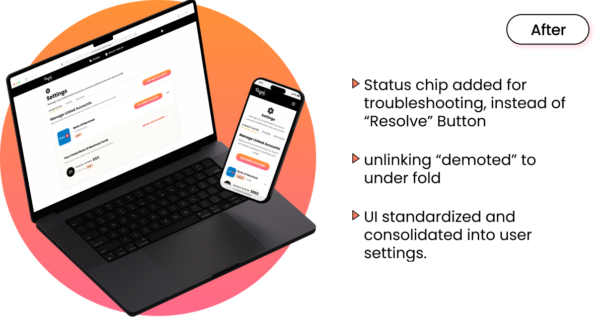
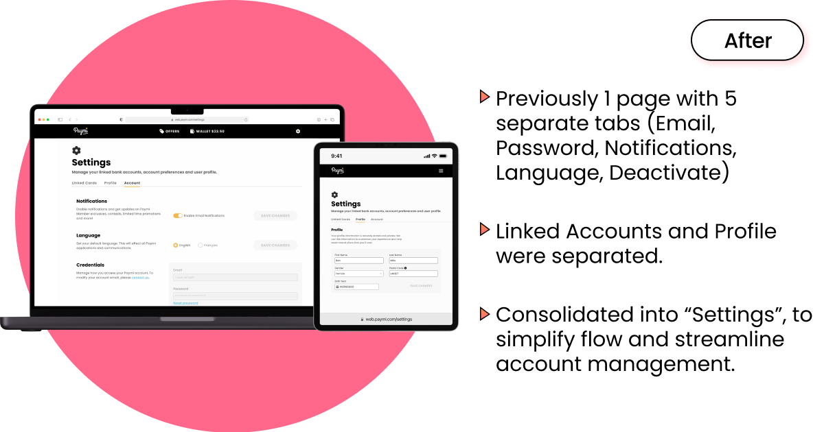
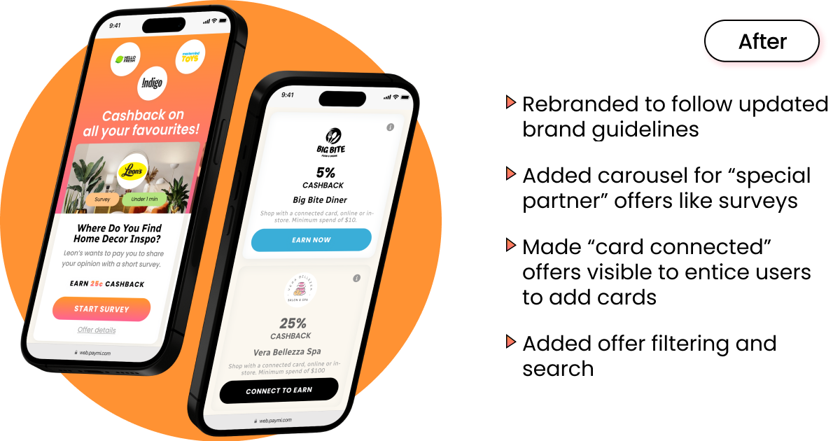
The project goal was to redesign the Paymi web app to increase card connections, improve usability, and build user trust while aligning with the updated Paymi brand.

Results & Impact

  • +15% card connections post-launch, the company's main KPI as card connections provided user data.
  • Reduced 17 pages & tabs → 6 pages & tabs, simplifying navigation while also removing unnecessary steps. 
  • By consolidating actions into fewer, clearer steps, this project reduced core task paths by up to 40%. This made key actions faster, easier to find, and more trustworthy to users.
  • Reduced “card connection” flow drop-off rate by 25% in the month following launch.
  • Users described the old app as “scam-like,” but preferred the redesign and said they’d “be more inclined to use” it during user feedback sessions prior to impelemntation.
  • Worked to create faster dev handoff & ensure design scalability through design-system-aligned atomic components.

Problem

  • Users could technically complete tasks, but the excessive steps, buried actions, and fragmented screens created friction, increased drop off rate, and fostered a lack of trust, leading to a small user-base.
  • Outdated, redundant web app with confusing navigation, especially for mobile users as site was not responsive.
  • Fragmented flows (including over different 17 pages & tabs) and inconsistent naming caused friction and frustration.
  • Inconsistent branding and visuals decreased credibility, and accessibility issues made the site less than usable.
  • The web app showed low card connections( the platform’s core revenue driver
  • Frequent functional bugs (card linking, redemption issues, cards randomly unlinking) further damaged confidence.

Process

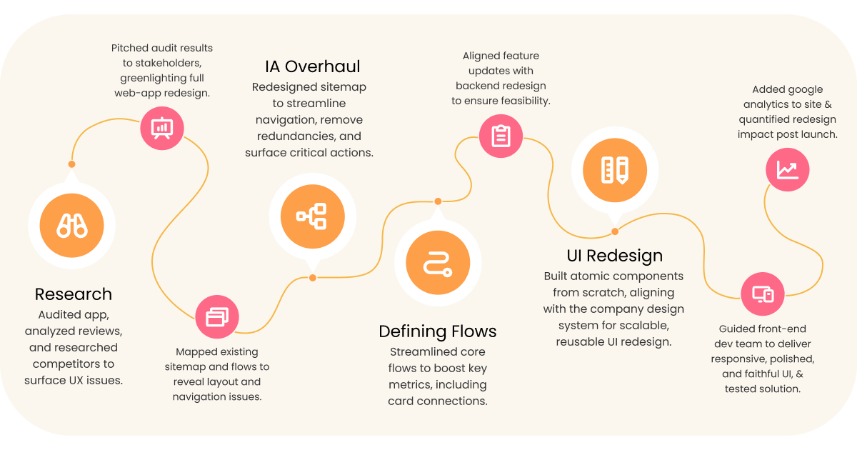
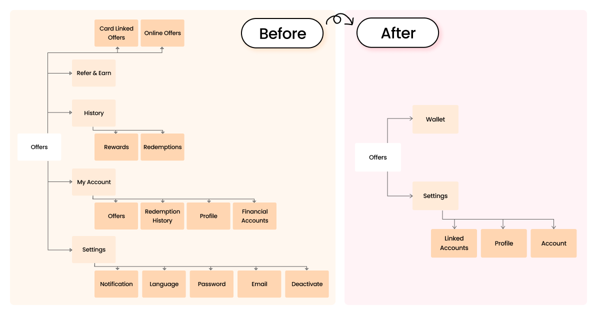
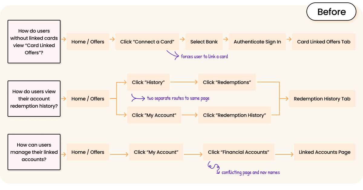
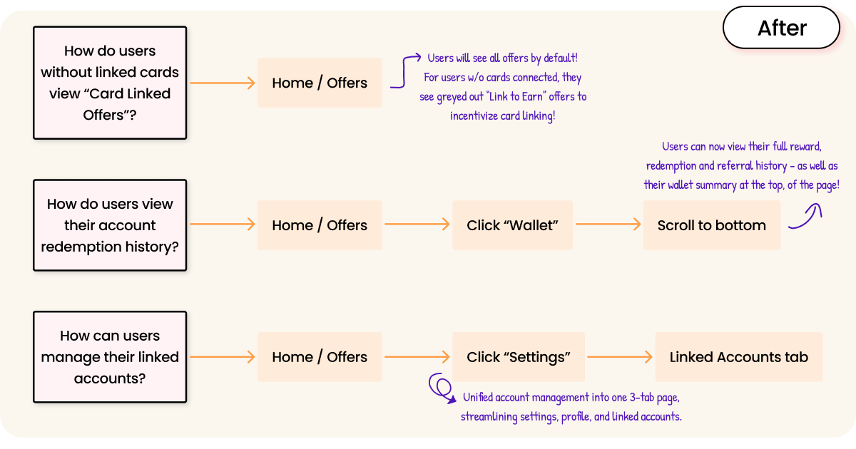
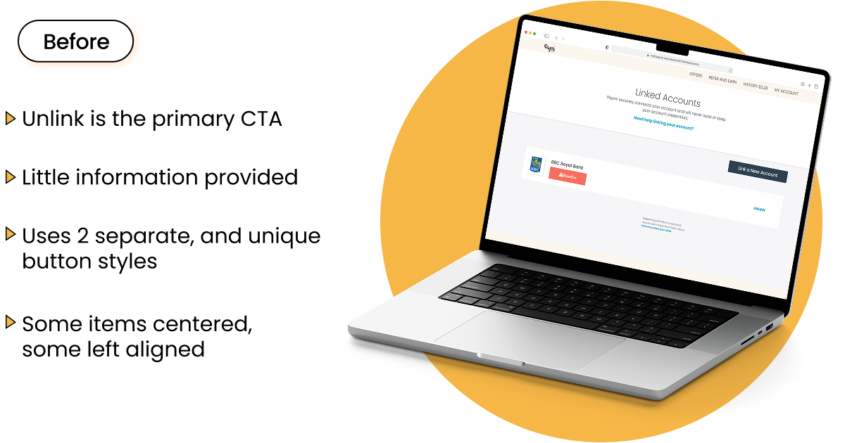
I redesigned Paymi’s web app through a lean process of heuristic auditing, flow simplification, and UI modernization. With tight time and research constraints, we validated changes with a small test group before launch (conducting A/B tests and task based user-interviews), while the redesign implementation was finalized.

1. Heuristic Audit & Problem Framing

  • I conducted a full heuristic audit, as well as conducting a competitor analysis and analyzing user reviews to surface usability, trust, and accessibility issues with the current platform.
  • During this phase, I found redundant pages, inconsistent visuals, accessibility issues and structural problems blocking key tasks.
  • After this research phase, I presented the findings to company stakeholders, connecting UX issues to business impact (low card connections, low retention, low credibility).
  • This pitch secured buy-in for a full redesign, which was prioritized alongside major backend fixes (stability in card linking, redemption, and transaction tracking) to improve the overall user experience.
  • My redesign decisions intentionally supported these backend improvements by highlighting the updated flows and rebuilding trust in areas where functionality had historically failed.

2. Information Architecture Overhaul

  • I rebuilt the sitemap around user goals, prioritizing key actions and grouping content under relevant pages.
  • This restructure consolidated 17 pages → 6 core pages, cutting redundancy and reducing cognitive load on the user.
  • Changes established a clear hierarchy to guide users through essential tasks and simplify their navigation.

3. User Flow Redesign

  • First I worked to map all existing flows, as no relevant user flows existed at the start of this project and documentation was needed prior to the redesign.
  • Next, I simplified flows using the updated site structure, to make accomplishing tasks as streamlined as possible.
  • For example, users can now view "Card Linked Offers" in 1 step, rather than 5.

4. UI Redesign & Design System Integration

  • My main goal with the UI was to modernize the interface using atomic design principles for consistency, scalability, and accessibility.
  • I built reusable components that matched the exisiting company design system to accelerate development, standardize the global "look and feel" of company products, & reduce future inconsistencies.
  • I also enhanced accessibility by ensuring WCAG compliance, increasing contrast, adding page hierarchy, and creating focus states for all interactive components.
  • It was also integral to update product branding (colors, icons, imagery) to match the current company "online presence" as well as modernize the look and reinforce trust in the company as a reputable service.
  • I then collaborated closely with frontend developers to guide implementation, ensuring alignment with the FIGMA design and company design system, as well as guiding interaction design, animation and other usability concerns.
  • Fun Fact : I was also asked to provide the French translation for this redesign, so that was done in this sprint as well.

Reflection & Key Learnings

  • The opportunity to present my audit findings was immensely helpful to this entire project. Not only did it secure stakeholder buy-in by linking design problems directly to revenue impact, but it also kickstarted internal conversations on the company's goals and future, which previously the design team had not been part of. This session not only clarified core issues and reasons behind the products "failings" to stakeholders, but it also informed the design team of some high-level insights that greatly improved alignment.
  • I appreciated being able to coordinate design with backend fixes. This was not always a practice at this company, but the alignment prior to design ensured the product not only looked better, but also rebuilt confidence in previously broken flows, without any disconnect or reworking.
  • Working with the front end development team directly also really helped me to better prepare my design files for handoff in the future. This was one of my first solo design projects at this company, so I learned a lot about how I can better communicate design intent to developers, and present the design in an intuitive but through way. This definetly changed the way I do handoff today.
  • My biggest learning was that consolidation, not complexity, drove impact. As a young designer, I often fell into the trap of always adding more to my designs. This was an amazing exercise in simplification for the sake of usability.
  • Given more time and resources, I would have conducted broader usability testing pre-launch (or even during initial discovery phase) to validate flows and uncover deeper insights on user experience. I was able to uncover many clear issues with auditing, as well as analyzing competitors and user reviews, but I don't think anything beats being able to sit down and talk to your user base when it comes to understanding user experience.
Note: The screens and flows presented here reflect my redesign at the time. I am no longer employed with Paymi, and subsequent updates to the live app do not reflect the design decisions and impact achieved during my tenure.