
iContribute is a volunteer-driven startup helping high school students discover meaningful and accessible volunteer opportunities in their communities. The mobile app connected students searching for volunteer hours with local organizations needing support.
When I joined the team, the app was struggling to adapt post–COVID-19. Students needed new ways to find relevant opportunities: remote, flexible, and safe, while organizers needed better tools to post and manage events.
Over six months, I helped redesign three core features: Filtering, Viewing, and Creating Opportunities, improving usability and engagement for both students and organizers.
I designed features for the mobile app, plus app store visuals and promotional graphics.
Role: UX/UI Designer & Graphic Designer
Team: 6-person design team (3 mobile, 3 web) under a product manager
Timeline: Starting Jan 2021, 6 months (part-time, ~12 hours of design work)
The project goal was to enhance the mobile experience with student-centered design updates that reflect post–COVID-19 needs, making opportunities easier to find, post, and apply for, while staying aligned with the updated design system.
After COVID-19, the volunteering landscape changed: many roles became virtual, required vaccination proof, or needed flexible scheduling.
But the app hadn’t evolved with these changes.
Key issues included:
The goal was clear: modernize the experience and make finding the right volunteer role effortless.
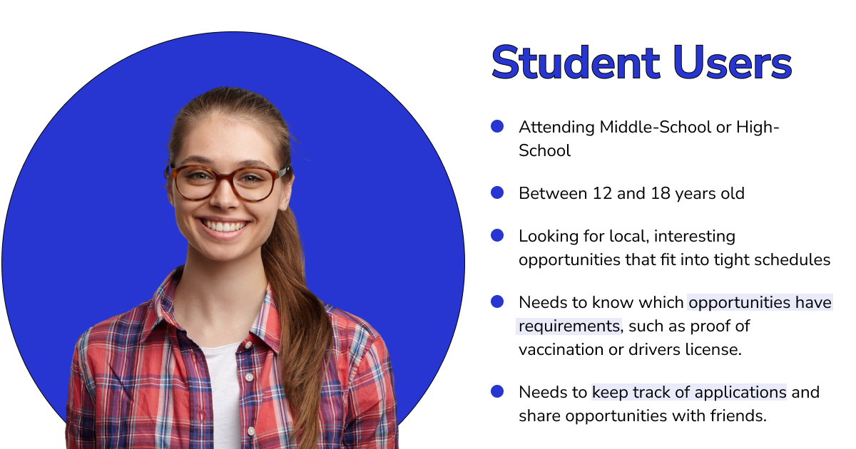
Students (12–18)
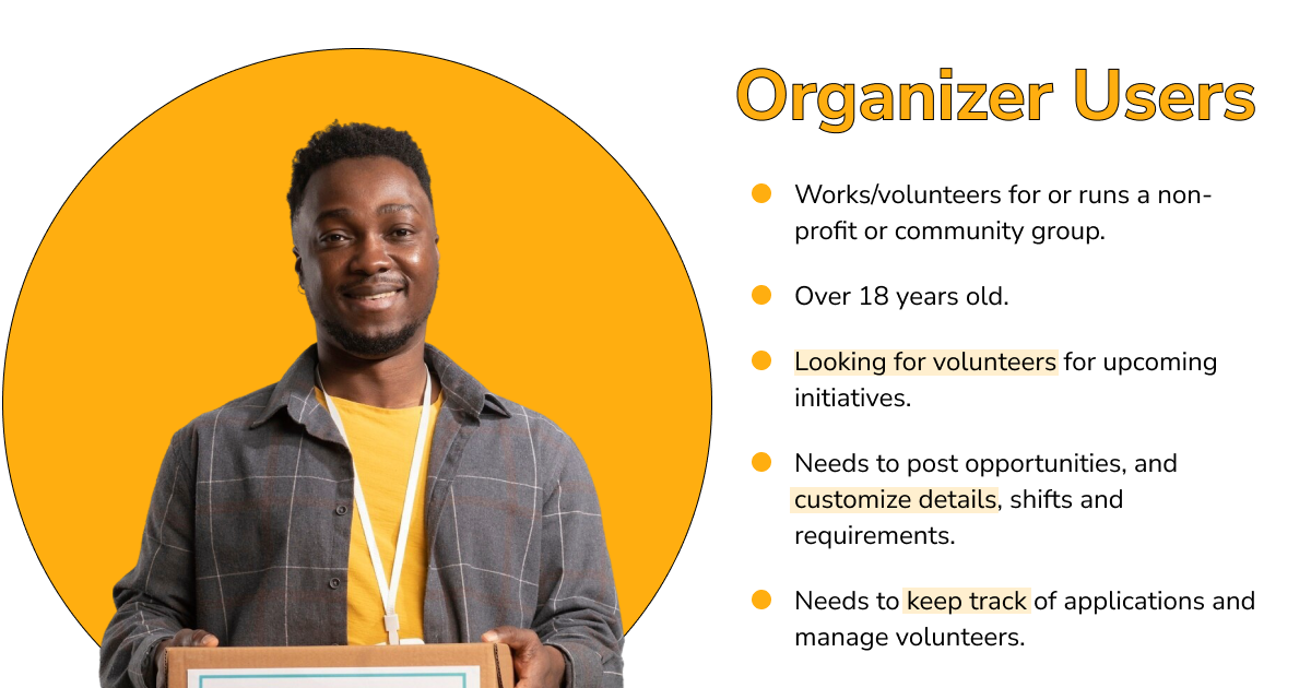
Organizers (18+)
Each designed feature followed a cycle of:
Briefing → Solo Design → Group Critique → Iteration → Handoff → Retrospective
This lightweight workflow worked perfectly for our small, volunteer-led team, allowing us to iterate quickly while staying aligned. All work and communications were done remotely.

Students were frustrated by endless scrolling. There was no way to narrow results by location, interests, or requirements.
I designed a simple yet powerful filtering experience that helped users quickly find relevant opportunities.
What I Did:
✅ Impact: Searching became faster, more intuitive, and frustration-free — giving students control over how they find opportunities.

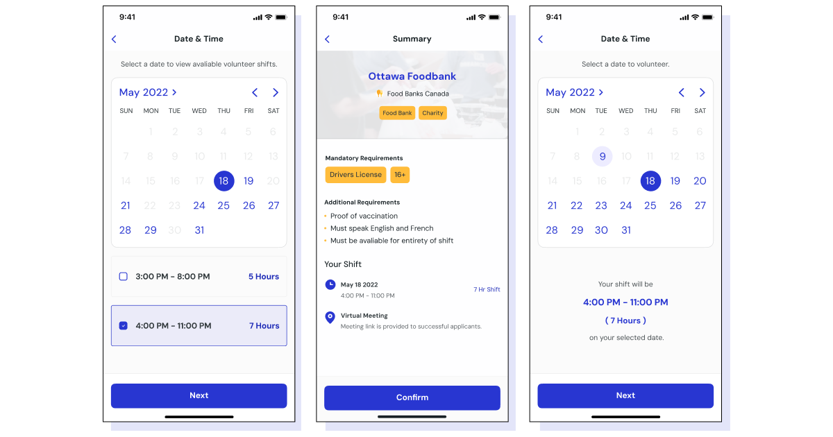
Students couldn’t tell if an opportunity was full or closed until after applying. The lack of information caused confusion and wasted time.
I redesigned the viewing flow to bring transparency and consistency to every listing.
What I Did:
✅ Impact: Students now see clear, upfront information — reducing drop-off and improving trust in the app.
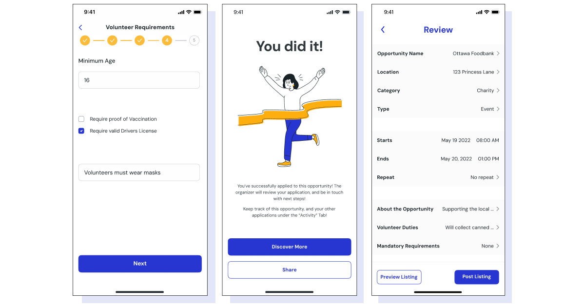
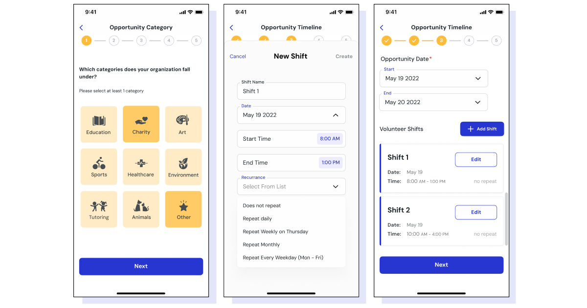
Organizers struggled to post clear, complete listings. The old process was confusing and limited.
I streamlined the creation flow to guide users through the process and make posting more flexible.
What I Did:
✅ Impact: Organizers could now post faster and more accurately, improving the overall quality of opportunities in the app.
Volunteering with iContribute was a highlight in my early design career.
It gave me the chance to:
Even though iContribute has since stopped hosting their application due to the founder's personal reasons, the mission—to help students give back to their communities—remains one I deeply value. The project reinforced why I love UX: using design to make small, meaningful differences in real people’s lives.